The controversial statement is this: a dashboard that shows everything is usually hiding that it is not sure what matters.
Dashboards are not read. They are scanned. Classic web reading research from Nielsen Norman Group found that people rarely read web pages word by word—they scan and pick out fragments that look important. A dashboard is basically a scanning interface, so the hierarchy has to be obvious.
Google/SOASTA research (as cited by Google) reported: When load time rises from 1 second to 7 seconds, the probability of a mobile visitor bouncing increases 113%.
When the number of page elements rises from 400 to 6,000, conversion probability drops 95%.
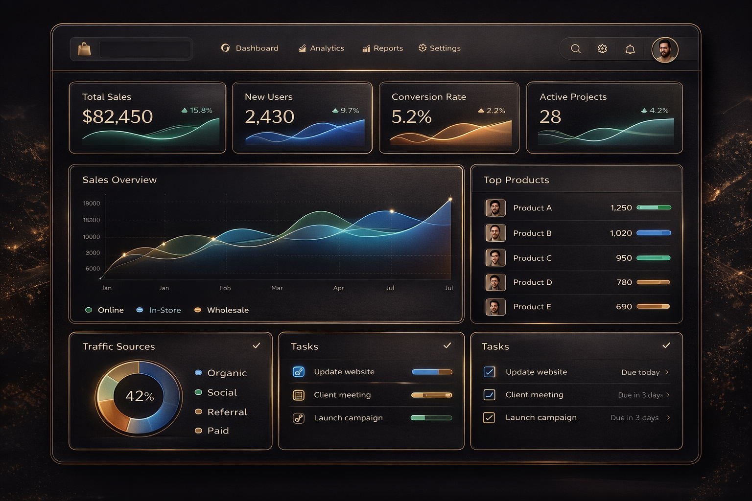
Dashboards often have the highest element counts in a product because they include filters, tables, charts, tooltips, and multiple scripts. The web is getting more complex dashboards follow the same trend WebAIM’s 2025 “Million” analysis reported that the top one million home pages averaged 1,257 elements, up from 1,173 the year before (a 7.1% increase). That same complexity trend shows up in dashboards when teams lack a strict component system and a performance budget. A dashboard system with clarity starts with a mental model.
A good dashboard answers three questions:
- What changed since last time?
- What needs attention now?
- What action should I take next?
If a widget does not support one of these, it is not a dashboard widget. It is a report and should live elsewhere.
- Design rules that keep dashboards usable Keep one primary story above the fold: top KPI row, one primary chart or table, one action area.
- Standardise card layout so every card shares the same structure: title, one key signal, one context line, one link to details.
- Treat empty states as first-class components. Empty state is not “No data.” Empty state is guidance.
- Use skeleton loading for stability. Spinners feel like waiting and uncertainty.
- Set a strict performance budget for dashboards: limit element count, reduce scripts, lazy-load below the fold.
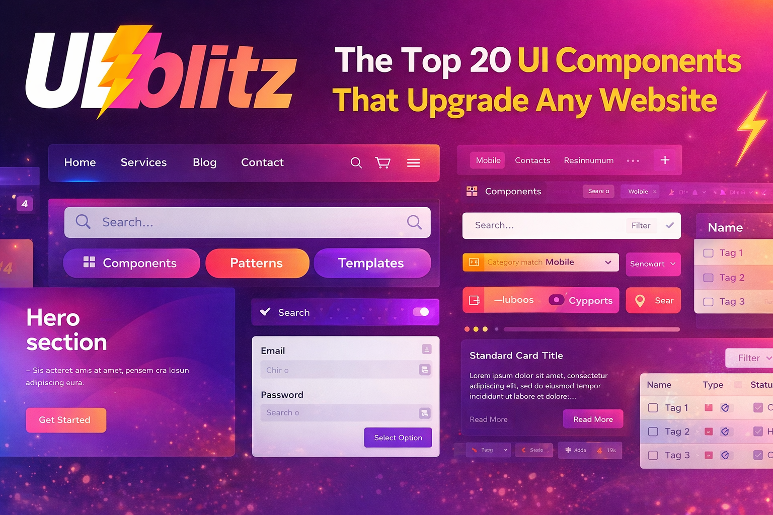
If you are building a dashboard, start from a dashboard component set with grid, cards, loading states, and empty states already solved. Then your team can focus on decisions and data instead of rebuilding layout logic.
Visit UIBLITZ: https://www.uiblitz.com (If you have a dashboard category page, add it here like: https://www.uiblitz.com/components/dashboard.