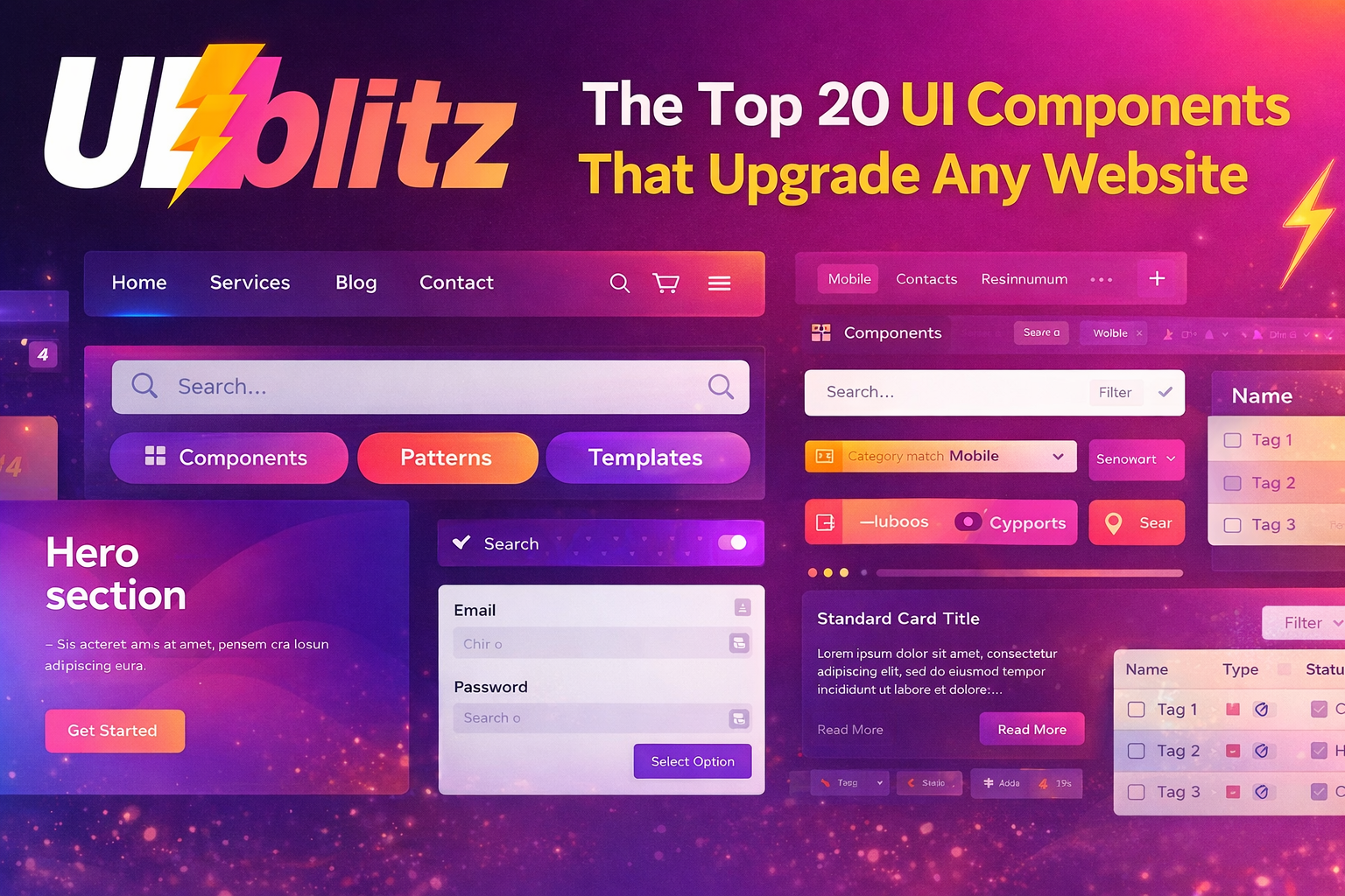
A
website feels premium not because of flashy gradients or animations, but because the basics feel consistent, complete, and reliable. Most average websites don’t lack talent — they lack a few core components and the states that make them work properly.
If you want to upgrade a website fast, focus on these
20 components for website:
- Navbar — clear labels, active state, clean spacing
- Mobile menu — thumb-friendly, easy to close, no scroll issues

- Hero section — what it is, who it’s for, one clear action

- Primary buttons — consistent height, padding, radius, color
- Button states — hover, focus, disabled, loading, error
- Typography system — clear scale, readable line height
- Spacing scale — consistent spacing, no random padding
- Form layout — labels, helper text, required indicators
- Form errors — specific messages, not vague warnings
- Inputs — text, email, password, textarea, select, checkbox, radio
- Search — results, no-results, filters, easy reset
- Cards — standard title, content, action structure
- Lists — clean spacing, alignment, easy scanning
- Tabs — clear active state, mobile-friendly, accessible
- Tables — sorting, alignment, overflow, row actions
- Table states — loading, empty, error
- Modals — easy close, ESC support, proper focus
- Toasts — clear, timely, not spammy
- Alerts and banners — info, warning, critical, one next step
- 404 and empty pages — helpful copy, next action, way back
The detail most teams miss
The real upgrade is not just having these components, it's having their states. A button without loading or disabled is incomplete. A table without an empty state creates confusion. A form without clear error patterns loses conversions.
That’s why a pattern library helps. Not just for copy-paste, but to lock design decisions before the UI starts drifting.
UIBlitz can be that reference shelf while you build:
Components
Patterns & layouts
Templates
Conclusion
Websites improve fast when they stop reinventing the basics. Lock these 20 components and their states, and your site will feel cleaner, more consistent, and more credible.
If you want to benchmark before you build, swipe in on UIBlitz: https://www.uiblitz.com